UPDATE:
Many thanks to all who submitted their logos and comments.
The Deadline for submissions has passed.
We are now working on choosing a logo or logo concept from the samples below. We will announce the winner in the near future. Stay Tuned!
UPDATE:
Many thanks to all who submitted their logos and comments.
The Deadline for submissions has passed.
We are now working on choosing a logo or logo concept from the samples below. We will announce the winner in the near future. Stay Tuned!


1a
or
1b
2
3
4
5
We actually like this concept a lot, but would like to see it more lively and eye-catching; kinda like the flying disc one above. The pixel boxes express our goal of integrating Torah with Technology.
6
Another version of the above.
I personally enjoy no. 5. It has a certain feel to it, that really seems to be what you’re tying to achieve.
How about modifying the scroll in #5 to have Hebrew chai (life) instead of the words “Project Genesis” on it and then put that on the scroll on the flying disc in #4. By putting the chai on the scroll, you put something symbolic of Judaism (what better way than to use Hebrew letters) and you imply the symbolism of the tree of life that is found in #1 and #3.
I guess the disc in #4 implies speed on the information superhighway.
“It is a Tree of Life for those who cling to it.”
7
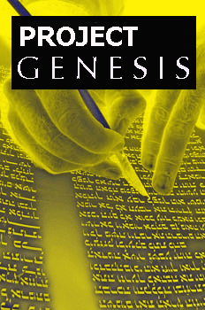
About #7 Wow…that was fast (pardon the pun given my 5/25 7:47 pm comment)…I want to ask about the box/square in the scroll. What does that stand for? Sorry if it’s a dumb question and if the answer is obvious. Could it be a monitor or should I say an LCD panel?
I think removing the disc is better since it conveyed more of a sports theme. I like #7!
I would go for either 4,5, or 7.
I haven’t graphical skills, but I’d like you to consider an open Torah scroll whose text area is completely filled with a button reminiscent of the Classic Windows Start button. In place of the Windows trademark icon would be an open megilla icon, with the parchment going up and down exactly like the Windows icon. (The goal here is to make everyone think of the Windows icon at first glance, while keeping Microsoft’s lawyers off your case.) In place of the word “Start” would be “Project Genesis”, probably with one word above the other.
If you like, a caption could surround the Torah scroll. Options include:
– Click to Delve
– Explore Your Roots
– Grow Here
– Learn More
– Start at the True Beginning
– The Ultimate Jewish Clique
I don’t have the skill to do a picture on my computer, but I have a suggestion. Since the Torah is G_D’s gift to man, why not have the scroll open as in #3 above but show a baby in the womb superimposed on it thus signifying the beginning of man’s relationship with the supreme along with the potential for growth.
I would be interested in your feedback concerning this idea.
Jerry
I like #6.
6 then 5 are my preference from the current logos. They could be worked over a little.
Another idea would be to keep the tie to the orginal logo in an updated form: Use the river idea from 1 – but get rid of the slogan and simplify the picture – similar to the cleaness of 5 or 6.
8
9
10
11a
 11b
11c
11d
11e
11f
I like #7 the best. I think it is very powerful and shows a lot of movement which makes me think of our fast paced world and how the Torah should be (and is) a part of that. I think the computer chips theme speak to our tech savvy generation. I wouldn’t mind seeing the Torah part have some more curves in it like the chips on the left side do.
12
Shalom. I just find this website, and I am a day late. Oh well…just to leave an opinion nevertheless…i like the 2b design. Powerful and reflective of the Psalm, Thy WORD is a LIGHT to my path…. All the rest are good, but that one is the best imo. shalom.
is it too late to submit a logo? Project Genesis implies the beginning,beginning of learning which in essence is really unending, hence the logo with simplicity, three unending symbols…do I write them as words since I don’t know how to type them on my keyboard…? how does one find three certain unending symbols?
Ooh, I like 11.
Shevuah Tov!
3/4 of the entries are…how shall I put it? Graphically challenged? And a few more are…complex?
I’m not entirely sure, but I think the Project Genesis icon is supposed to be something simple. Something you can smack on coffee cups, stickers, etc.
I personally favor both #7 and #6. 6 is simple and good looking. 7 is also simple but not as much as 6, yet, looks more savvy than 6.
A few submissions came in just before the buzzer.
13a
13b
13c
14
I like both 5 & 6, they’re simple, clean, and get the point across.
I don’t like 7, it looks too… cliché, overdone.
Ya know, now that I’ve looked over the new ones, I’m starting to agree with daNi.
Also, what’s with the square inside the Torah on #7?
same here although if 13b wasn’t so big maybe but i like #6
I like 6 and 7 a lot, but there is something a little too cold about them. I think maybe it is the font. I’ve seen the bold/roman look in many different places. It doesn’t feel right here.
My second choice would be 1a/1b. That is a warm and inviting logo.
I like the idea of #7… but I think that it needs to be adjusted a bit. The problem with it is that the Torah scroll and the trailing pixels look like two separate images… they need to be integrated together to be *one* image, sort of like the Torah scrolls in #5 and #6.
One more thing — I also like how the shadowed effect in #6 gives the logo a professional feel. I would use that effect in #7
I like no.11. shows what the web site is and depicts the idea of the computer age without forgetting its Torah yu are talking about.
i like number 11
i like no.11a
I liked the number 11 set they are clean and are concise portraying the mission of project Genesis
great logo
Since the site was born on the internet, the use of computer graphics appears redundant to me. The beauty of the WORD shown in 1 a & b is quite the sign of the completeness of our creator being opened to those of us blessed with access to “Project Genesis”.
I like 1a, 10 and 12.